Before the remodel, this home suffered from a dated circular layout that was cramped and inefficient. Transforming the dark foyer with the addition of an entryway to the light-filled breakfast room off the kitchen dramatically improved the feel and flow.
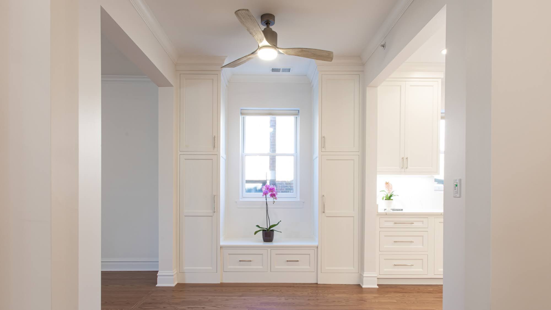
During the design/build process, we worked with the client to create a layout that worked for their lifestyle and aesthetics. Though we moved no exterior walls, the place feels bigger and brighter. In addition, the improved layout ties the spaces together and provides more useful storage solutions.
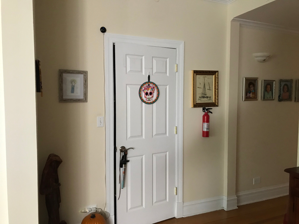
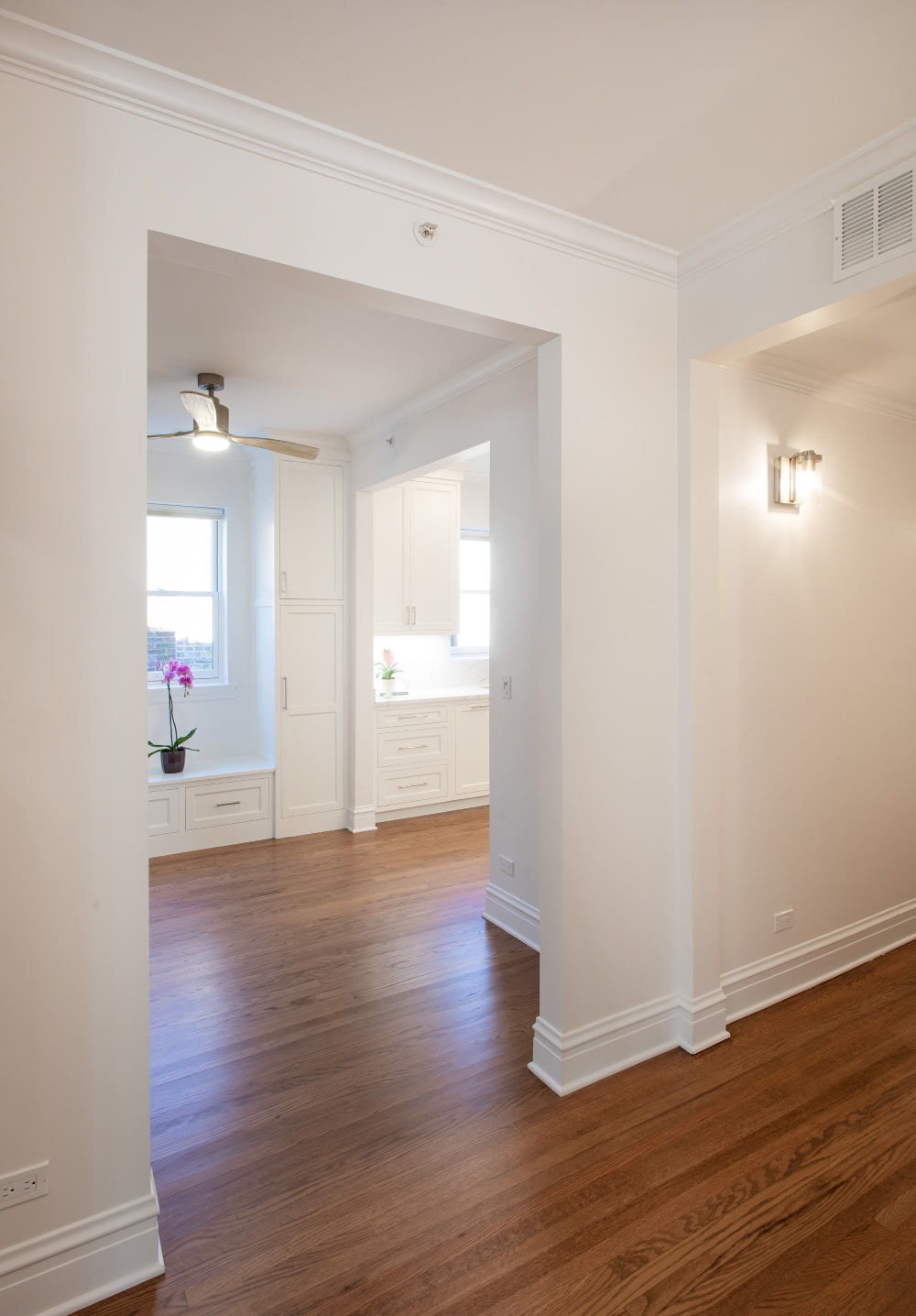
The photo above was taken from just inside the front door. We replaced a coat closet about eight feet from the door with an opening into the next room to open up the space as a part of a whole house remodeling project. The light-filled breakfast room greets you from the front door, kitchen, or dining room. The new built-in window bench, with drawers and a window view, provides a pleasant seat and practical storage. Everything about it is an improvement over the previously dark vestibule.
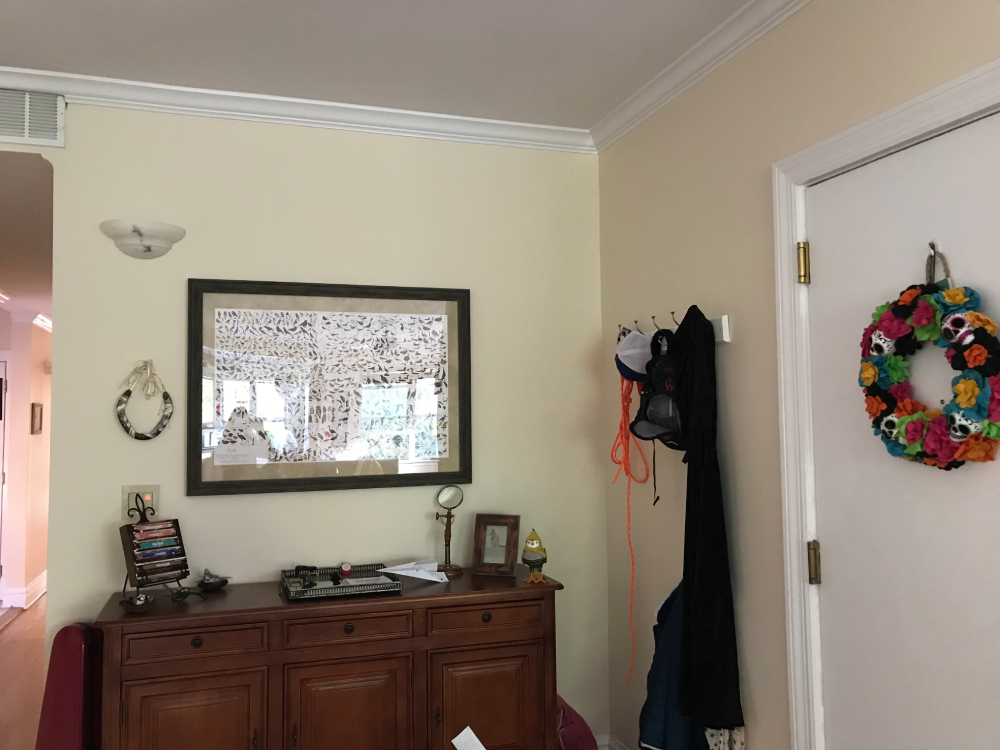
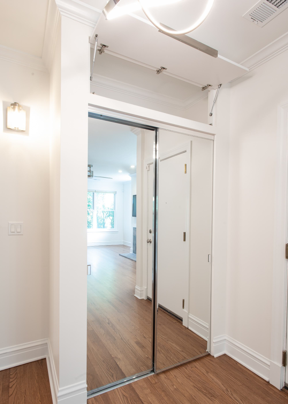
We built a larger coat closet to the right of the front door, incorporating extra storage with a convenient garage-style door for infrequently used items. Clutter that previously gathered around the front door is neatly tucked away behind mirrored doors that reflect the natural light and give the illusion of more windows.
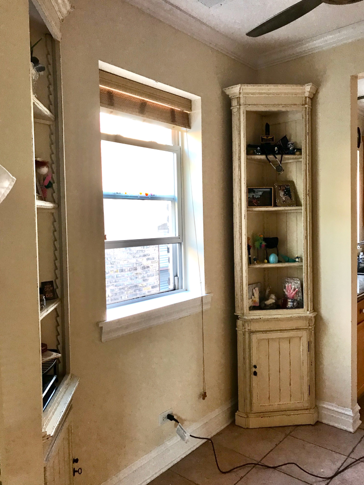
Previously, the breakfast nook had the charm of a pantry hallway or cramped galley kitchen. It’s now the home’s heart, connecting the busiest sections of the space like the hub of a wheel. The room’s naturally bright vibe invites you to linger with your morning coffee, and there’s plenty of storage space in the tall cabinets with pullouts and outlets inside to store and charge laptops, tablets, phones, and school/work-related items out of the way and ready to go.

The light-filled breakfast room greets you from the front door, kitchen, or dining room. The new built-in window bench, with drawers and a view out the window, provides a pleasant seat and practical storage. Everything about it is an improvement over the previously dark vestibule, and while this is still a transitional space, it’s nice to walk through and invites you to sit down and relax. We’ve been told it feels like entering a completely different home.
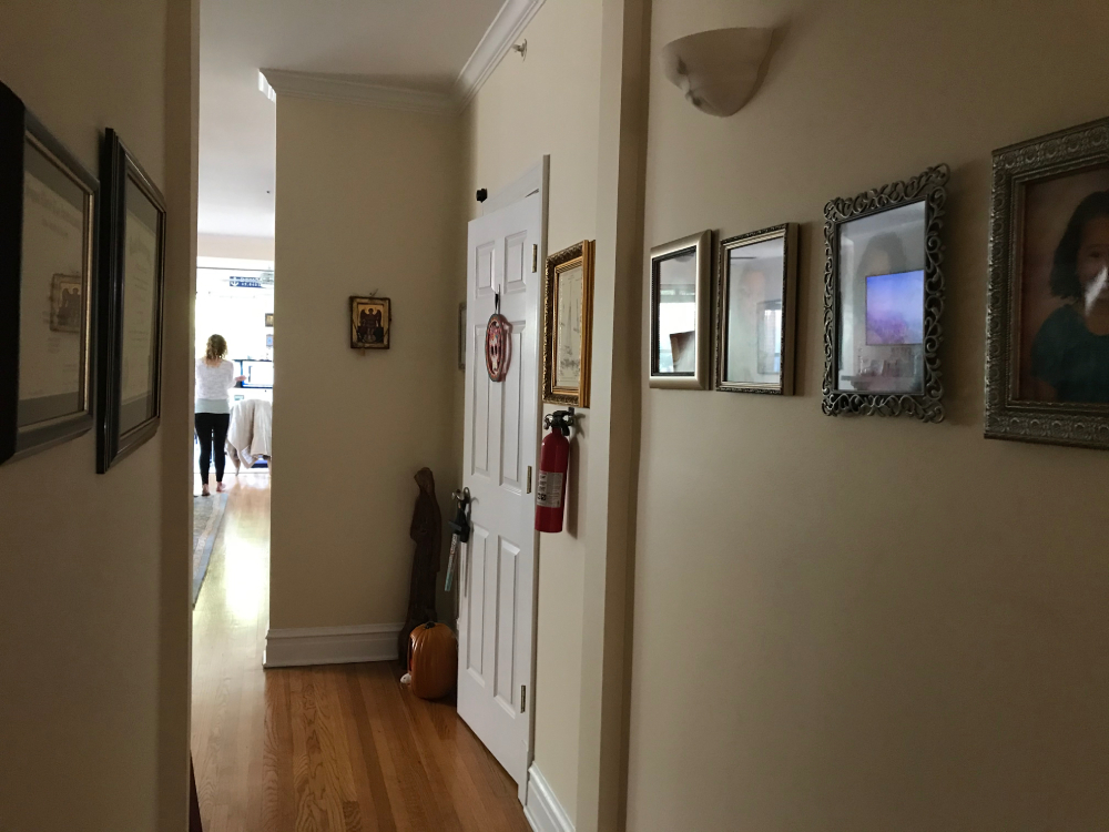
The fresh color palette, wide entryway, and new sconce lighting continue the bright, open feeling into the hallway leading to the back of the home, and a ceiling fan in the breakfast room circulates fresh air from the open windows.

