Building this dream kitchen meant a chimney running through the center of the house had to come down.
Removing obstacles gives a fresh perspective
A mid-century renovation hadn’t provided much cabinet storage or counter space in this kitchen, especially around a busy work area like the stove. Short upper cabinets had chunky wood-paneled cornices above, darkening the room and wasting space. An unused exterior door to the left of the stove prevented that corner from serving any useful function.
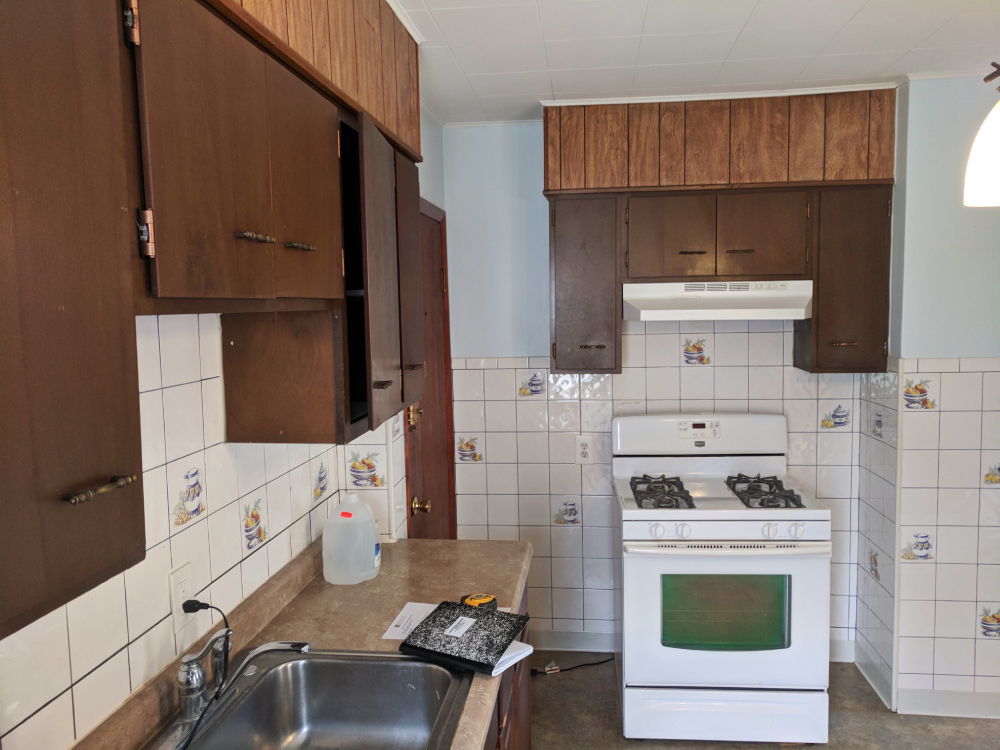

The most significant structural challenge was removing a defunct chimney hidden in the wall to the right of the stove. It blocked the dining room entry and created a narrow zig-zag hallway between the kitchen, dining room, and a bathroom to the right of the kitchen.
Our first step in this remodeling project was removing everything and taking the walls and floors down to the original 1890s wood supports and lathe and plaster walls. Next, we removed a little-used exterior door and replaced it with a wall, new cabinets, and shelving. Last but definitely not least, we removed the brick chimney, so it no longer cut off the kitchen from the rest of the house.
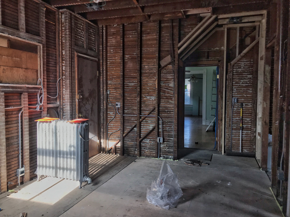
This photo was taken after we removed the chimney. The dining room doorway (on the right) is now unobstructed, and the wall overhead is framed with a partial archway, further opening the room. On the left, new drywall, cabinetry, and countertops will cover an unused door and window. In the middle of the floor, a plastic-wrapped plumbing drain and supplies mark the island sink’s future location.
Building the dream
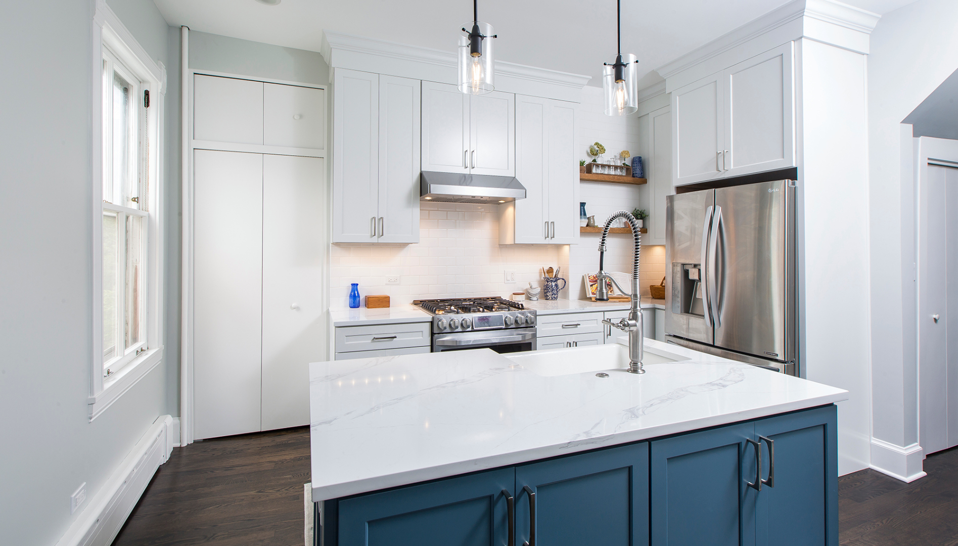
In this newly expanded space, we created the homeowner’s dream kitchen, including a full bath, mudroom, and new dining area. To begin, we relocated the appliances, most notably pulling the refrigerator out of an awkward closet. We built an island with added storage, a quartz countertop, a dishwasher, and a striking Kohler cast iron sink with crackle glaze.
We increased storage with upper cabinets extending up to the ceiling, topping them with crown molding for a custom look. Floating shelves, made from wood reclaimed during the demolition, hang on the wall where the exterior door used to be.
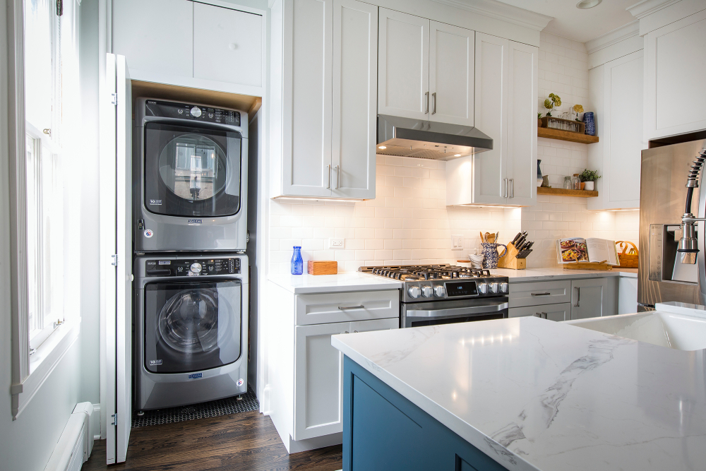
With this kitchen remodel, shifting the appliances and the sink locations meant reconfiguring plumbing and electrical throughout the plan. In addition, the homeowner wanted to pull the convenience of laundry out of the basement, so we stacked the washing machine and dryer in the closet that formerly housed the refrigerator, hiding them behind folding doors.
Improvements to the window area included removing the radiator and cabinets. We added casing around the window, replicating the home’s period look. White cabinetry and countertops, light-colored paint, and white tile increase the feeling of spaciousness.
Widened doorways create new rooms
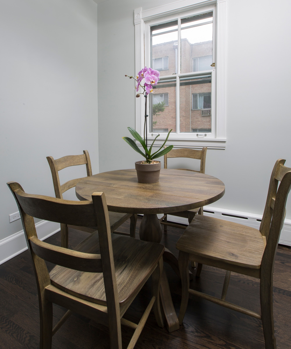
Incorporating a cramped back room into this kitchen remodel significantly impacted the feel of both spaces. We removed the doors to this room and the adjacent back entryway and widened both openings to create a pleasant eat-in extension to the kitchen and new mudroom. The breakfast room easily doubles as a crafting or homework area or a cozy spot for a casual dinner.
The room feels larger with the dark wood paneling and linoleum flooring removed and a lighter wall color coordinating with the rest of the kitchen. Finishing details include new baseboards and period-recreated window trim, a low-profile cast-iron baseboard radiator to heat the room without taking up space, and oak floors refinished with an ebony stain.
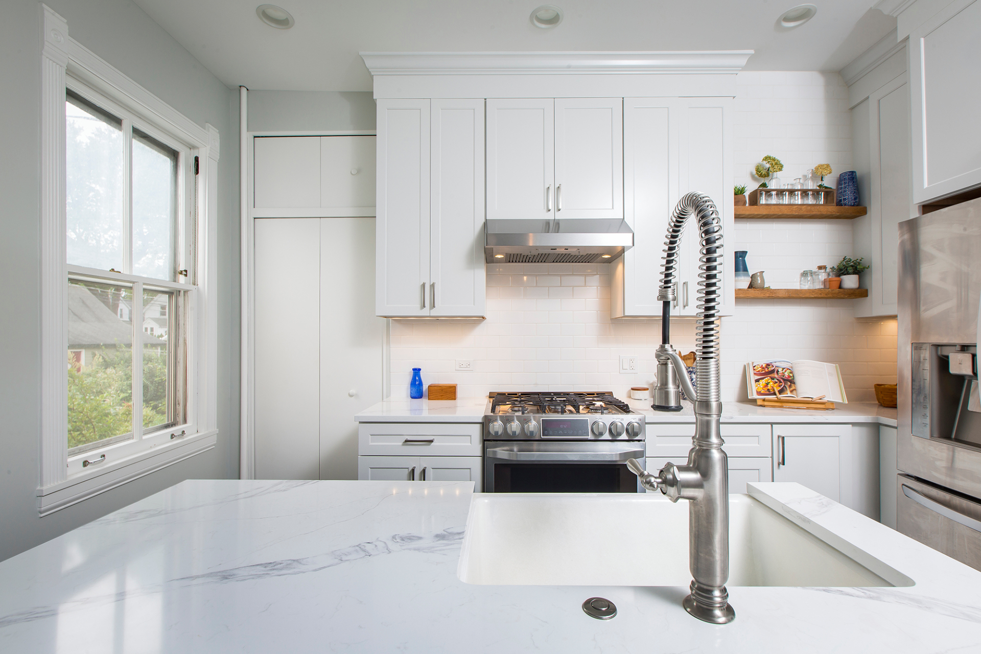
Here’s a final look at the new kitchen, ready for the next century of family gatherings and culinary arts.
