Demo · Build · Transform · Enjoy
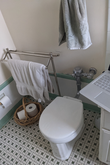
Before
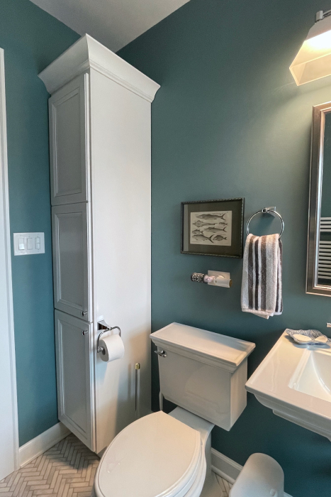
After

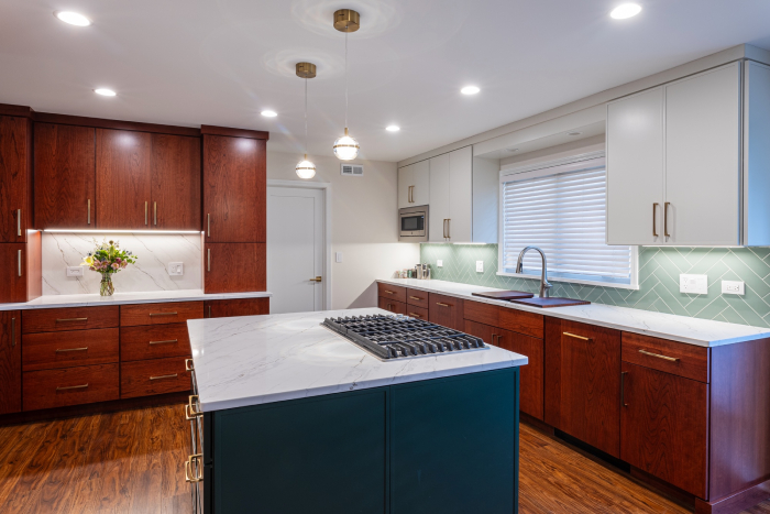
With the soffit removed, new cabinetry reaches the ceiling. Over the island, pendant lights replace a large fluorescent panel to illuminate the cooktop area and create a mood.
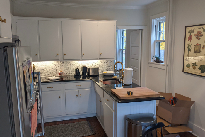
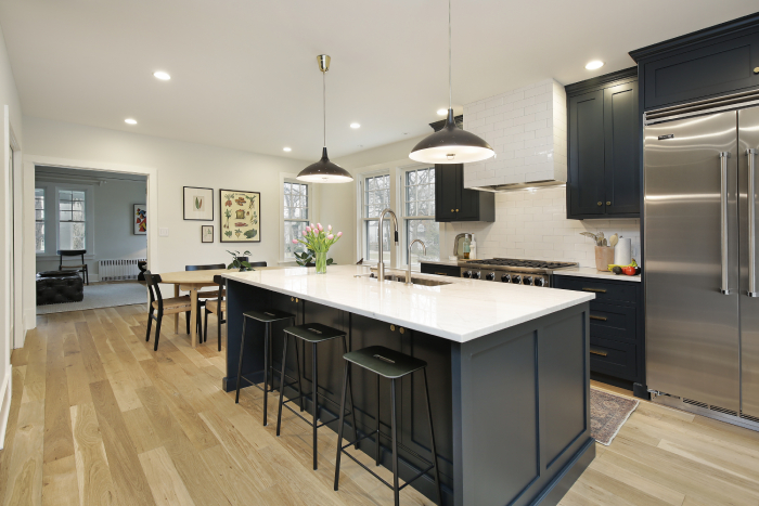
Removing the wall between this cramped kitchen and the dining room dramatically increased spaciousness and storage.
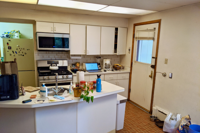
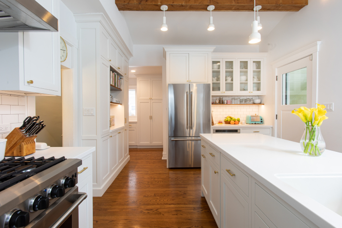
The improved flow achieved by removing the peninsula also created better sight lines.
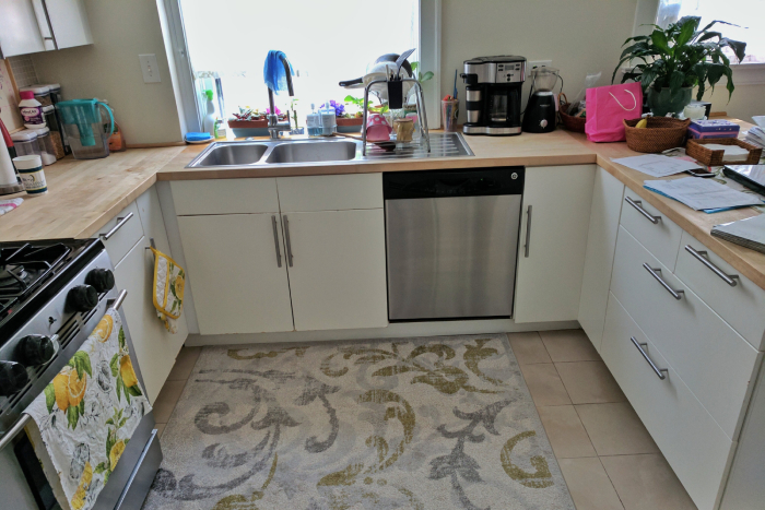
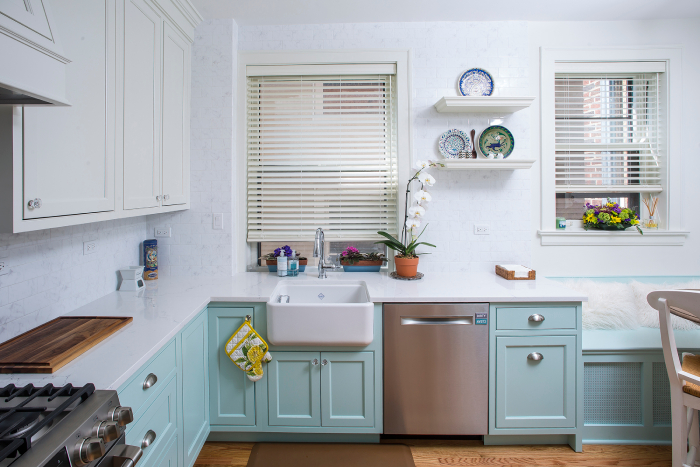
A brighter, more open, and colorful space.
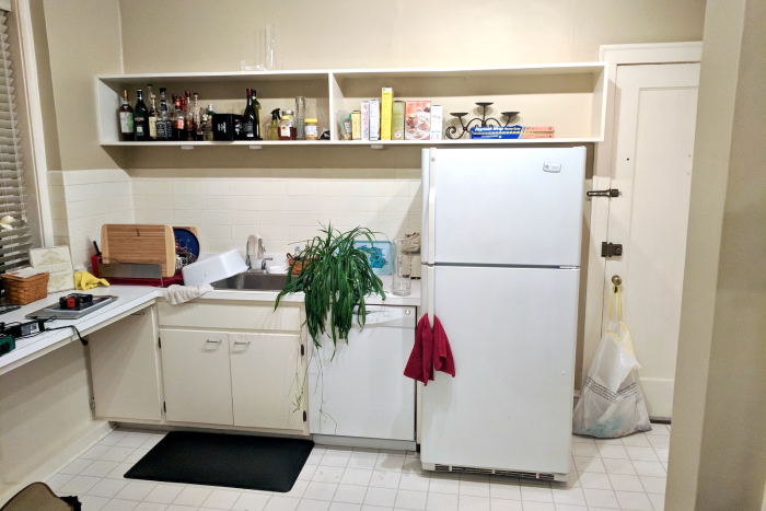
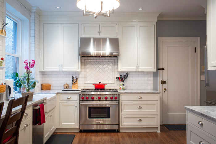
This kitchen remodel increased cabinet storage and counter space, moved the sink under the window, and reoriented appliances for improved flow.

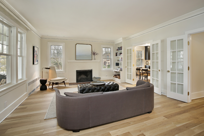
We added French doors to the kitchen and replaced the flooring, tying the spaces together.
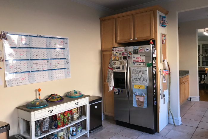
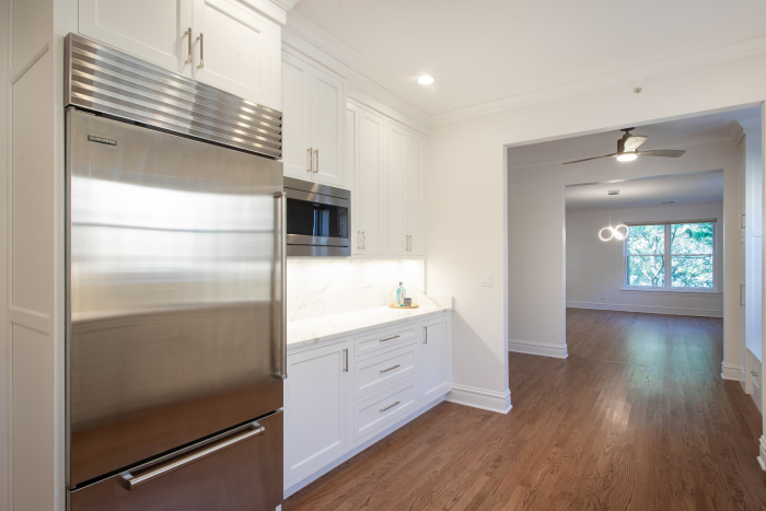
Shifting the refrigerator location allowed for more countertops and cabinetry.
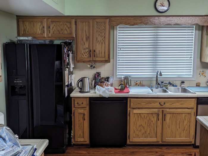
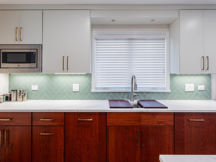
The fridge moved off this wall and was replaced by additional storage and a new microwave that no longer takes up counter space.
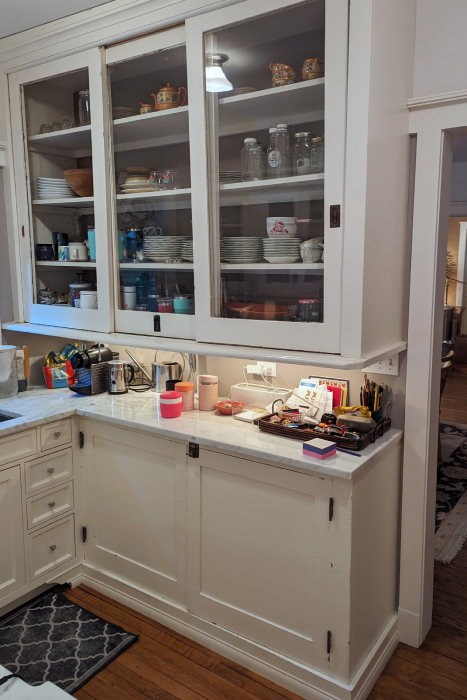
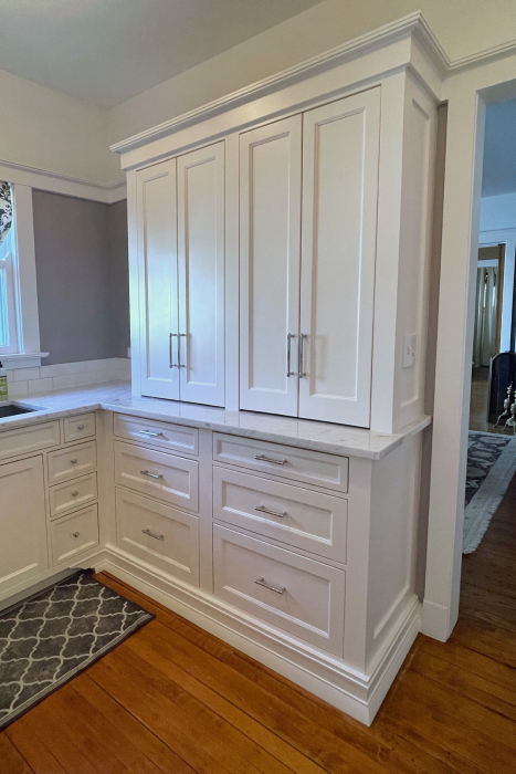
We installed our custom-built cabinet and reused the existing countertop. The doors above the drawers conveniently retract into the cabinet.
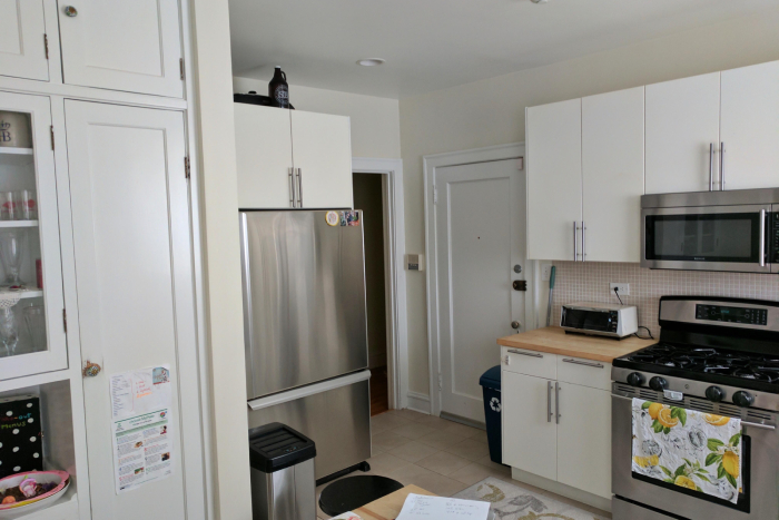
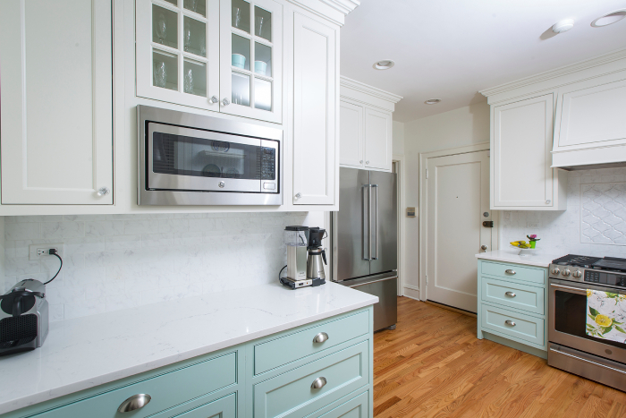
A new built-in (left) doubled counter space and located the microwave in a more convenient spot.
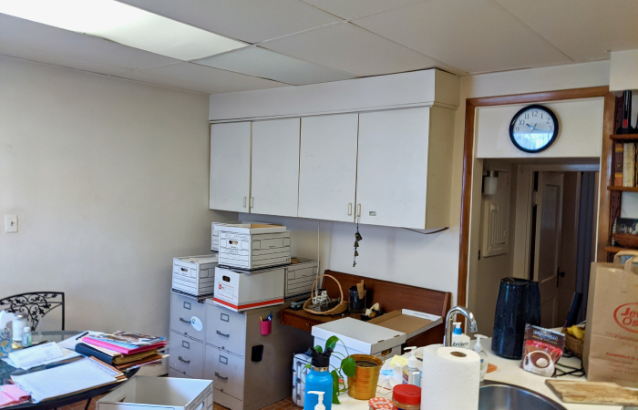
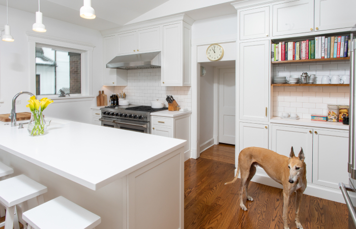
The eating area and built-in desk were reimagined as an island and cooking station. We added a window and raised the ceiling.
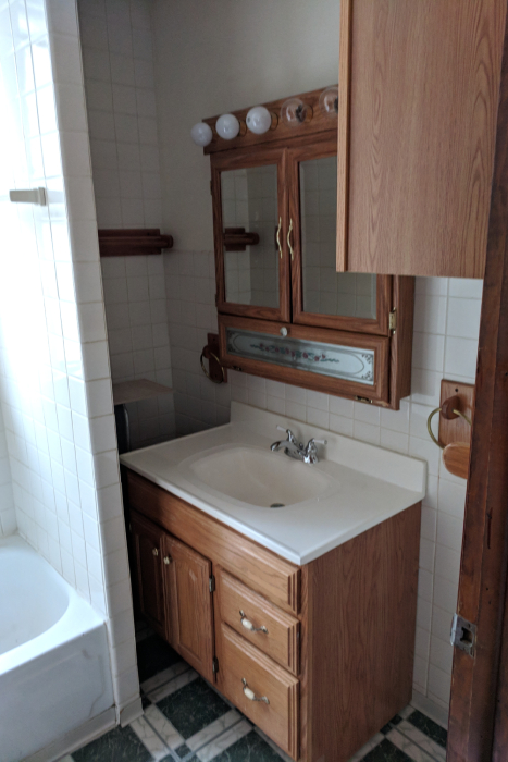

We gutted the room and shifted each element to a new location. The old radiator, oddly tucked in the corner, was replaced with a cast-iron baseboard radiator.
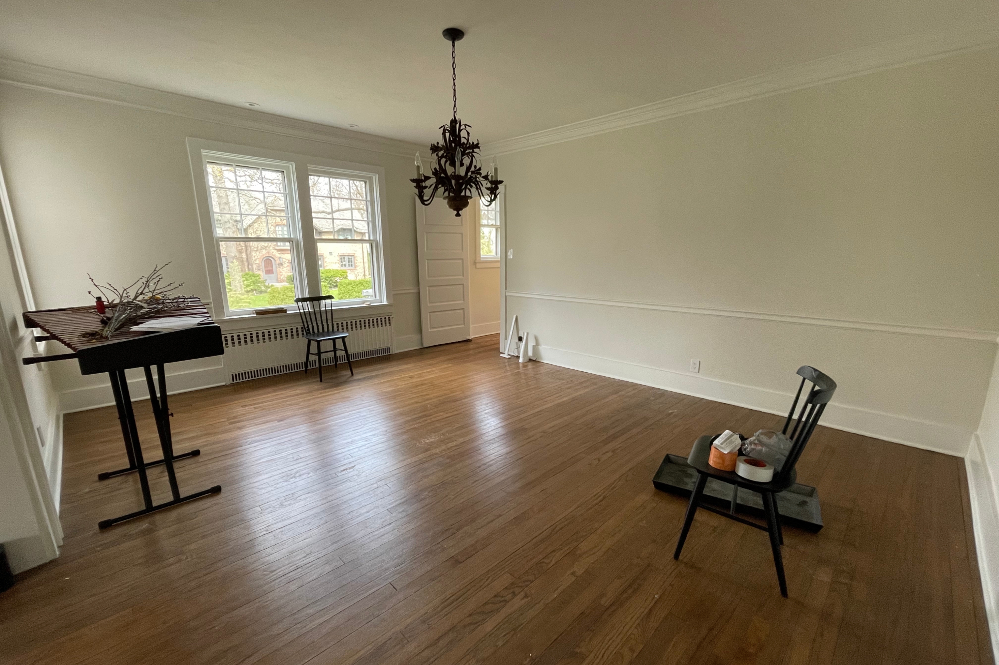
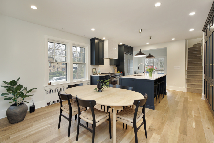
The wall between the kitchen and dining room was removed and a steel beam was installed overhead to allow for a seamless ceiling.
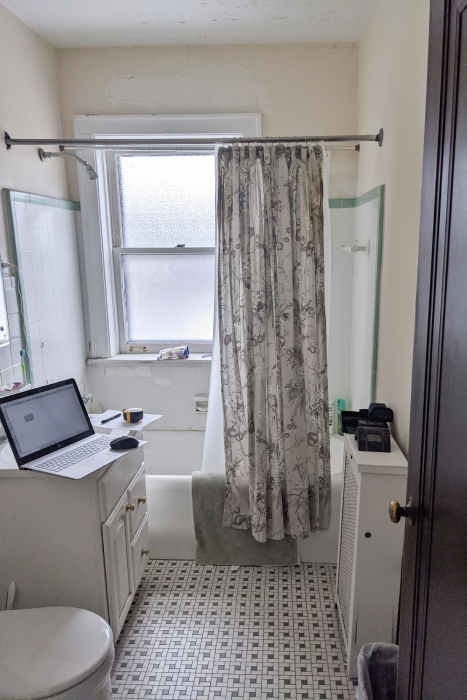
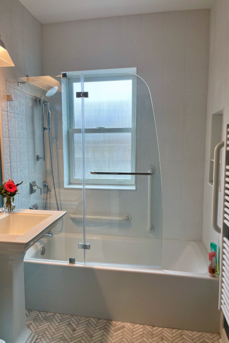
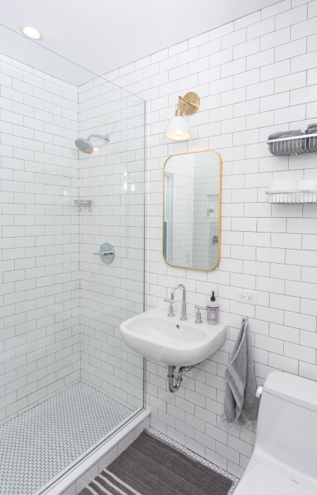
Swapping a shower curtain for a glass enclosure increases the light and sense of space.
A less opaque window also increases the natural light.
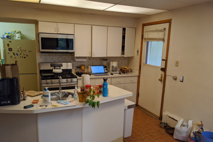
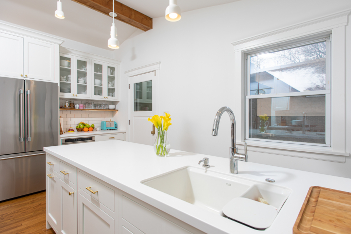
Once an obstruction, the peninsula’s new location makes it the heart of the kitchen.
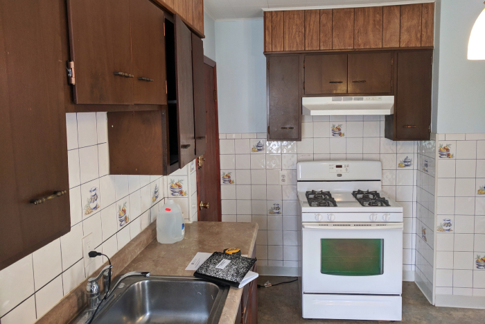
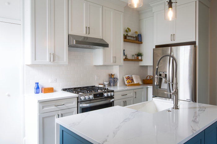
We removed a little-used exterior door and replaced it with a wall, new cabinets, and shelving. The stove and refrigerator were relocated, and the sink jumped over to the new island.
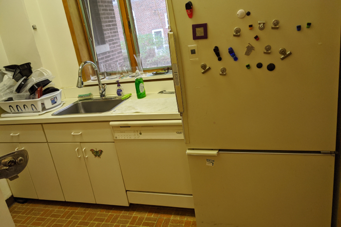
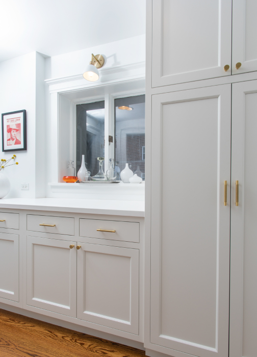
The butler’s pantry sink, dishwasher, and refrigerator were replaced with storage cabinetry.

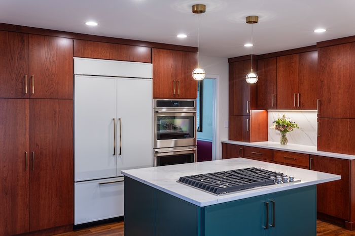
A dated built-in desk and cluttered countertop for the microwave and toaster oven (left) were replaced with floor-to-ceiling cabinets and a chef’s dream fridge with coordinating cabinet faces.
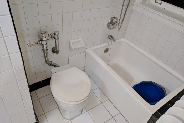
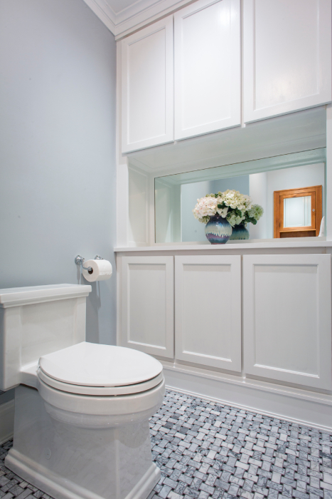
This built-in incorporates crown molding for a seamless look, and a mirror in the middle makes the room feel larger.
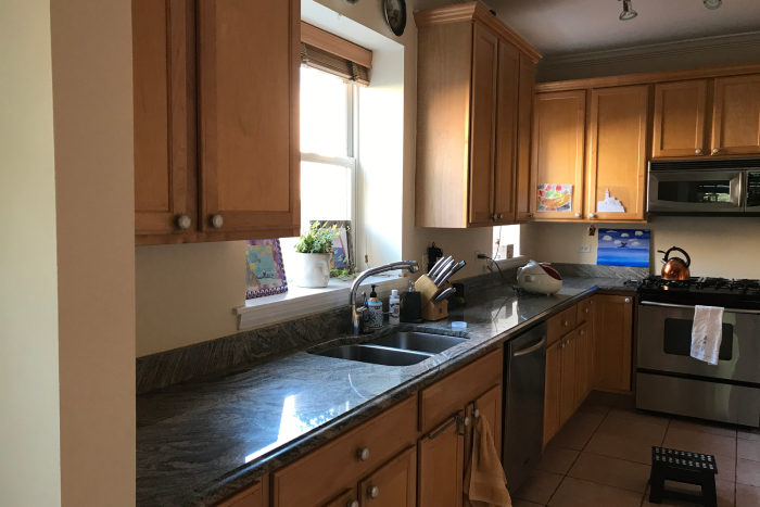
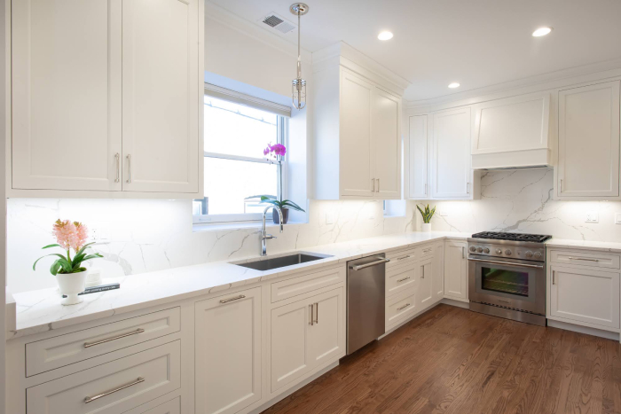
Similar layout with completely different results.
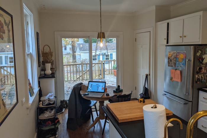
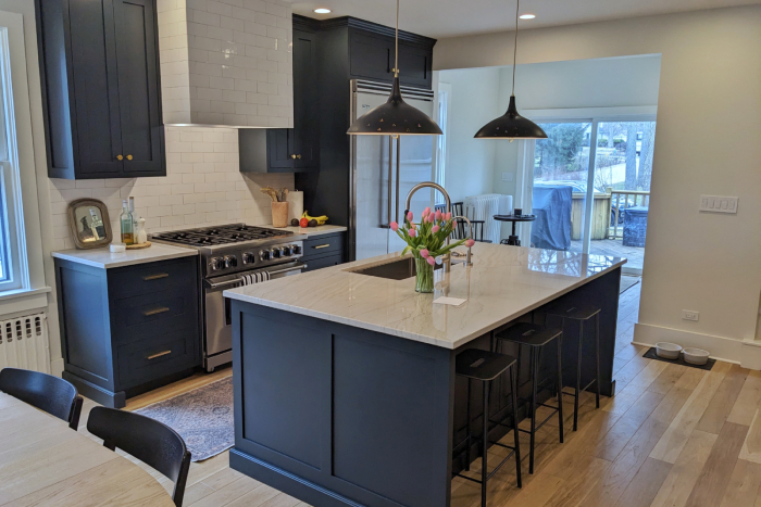
We brought in the wall on the right to add a generous closet in the new mudroom.
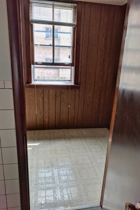
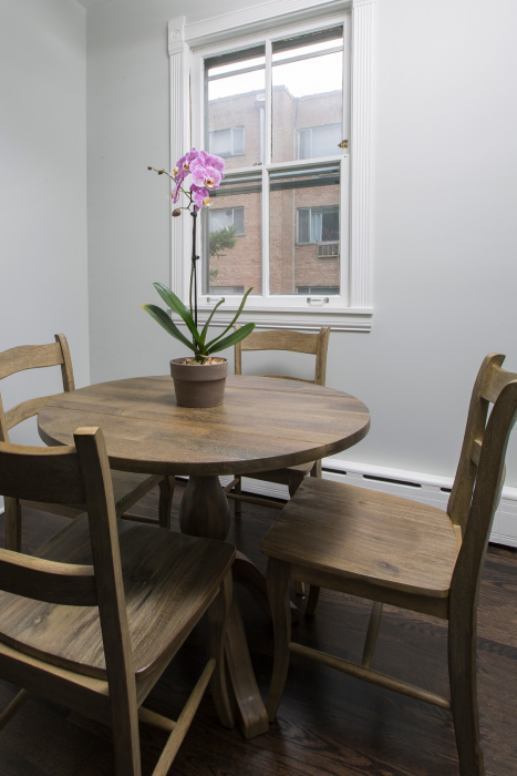
We removed the door and widened the opening between rooms to create a pleasant eat-in extension to the kitchen.

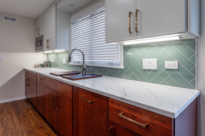
Double dishwashers in a Kosher kitchen remodel blend seamlessly with the cherry cabinetry.
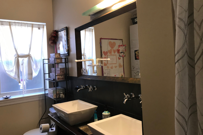
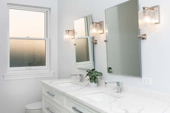
A brighter room with storage in the vanity, twin mirrors, and flattering sconce lighting.
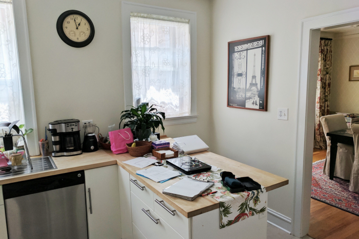
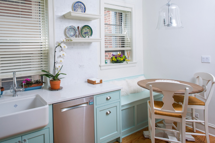
Removing the peninsula cabinet increased usable space in the room.
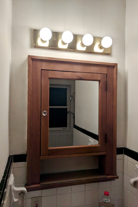
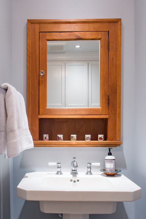
This bathroom remodel included restoring a vintage 1927 medicine cabinet.
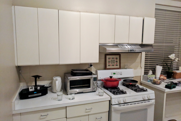
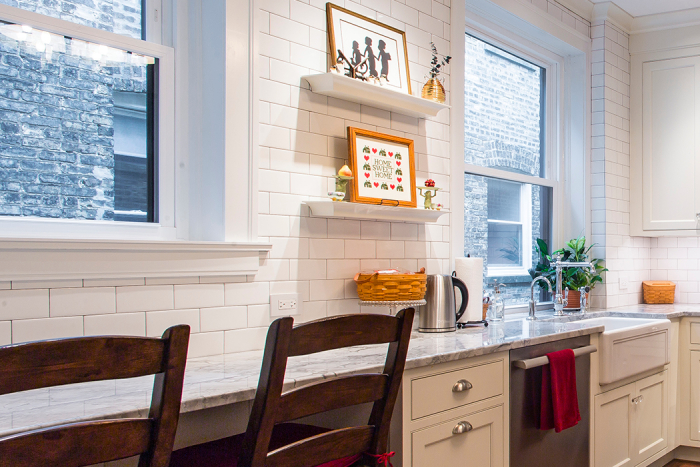
This kitchen was completely transformed by revealing a second window previously hidden behind the oven, hood, and surrounding cabinets.
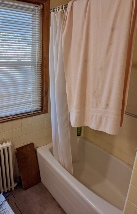
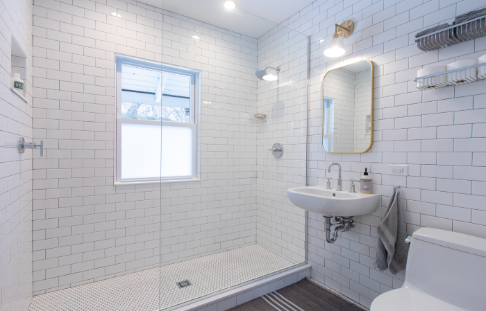
Removed the tub and reoriented a walk-in shower in line with the window.
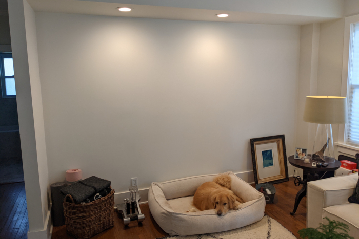
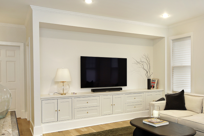
An odd nook was transformed into a cozy media built-in with storage.
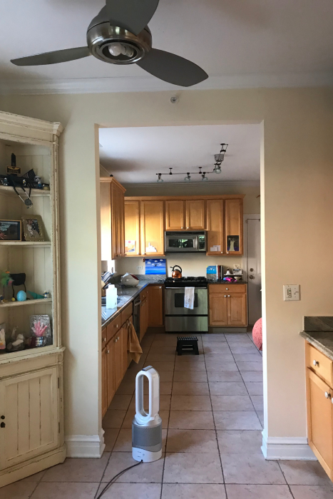
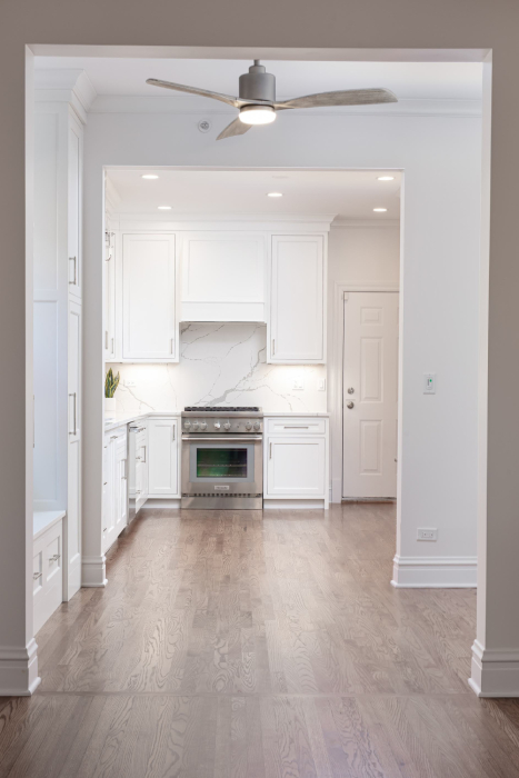
We enlarged the opening to the kitchen.

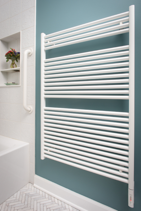
This 100-year-old radiator was retired and replaced with a wall-hanging towel warming rack.
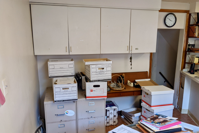
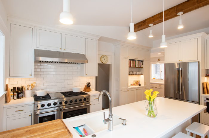
The desk made way for a more open floor plan.
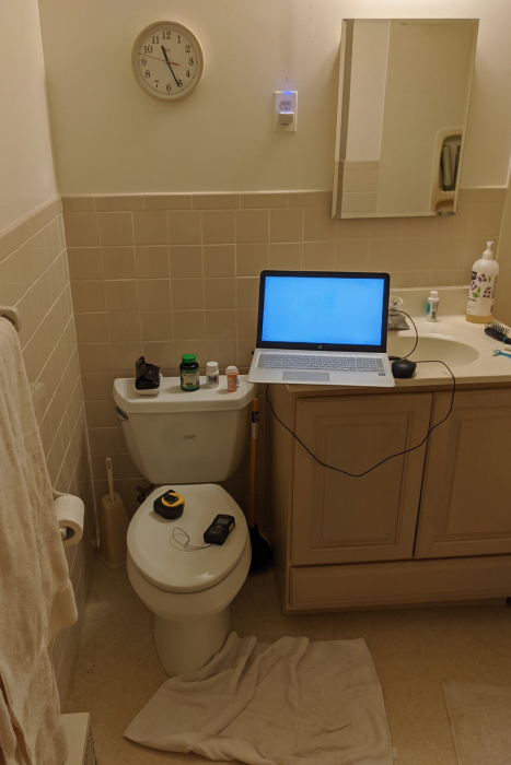
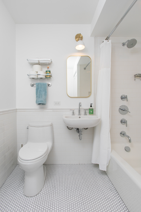
What a big difference, despite all the fixtures remaining in place.
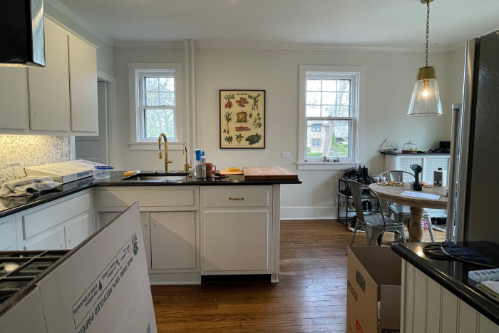
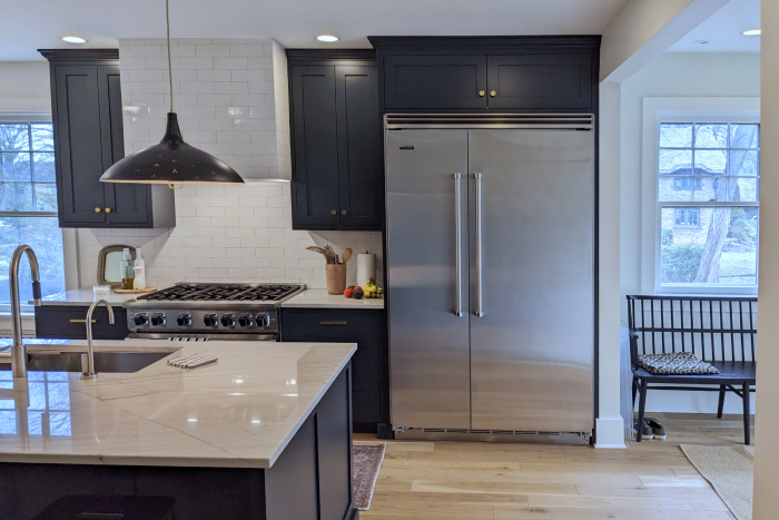
We added a wall to section off the mudroom (on the right) and hide the refrigerator from view when entering from the backdoor.
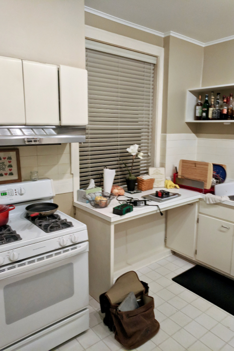
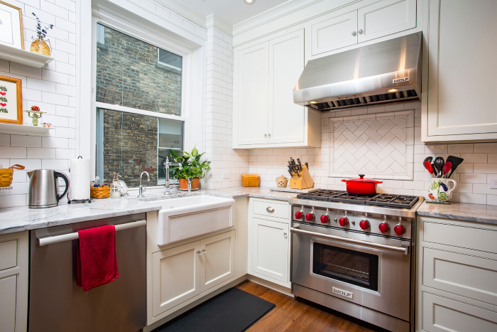
An open makeshift counter under the window was replaced by cabinetry and a farmhouse sink.
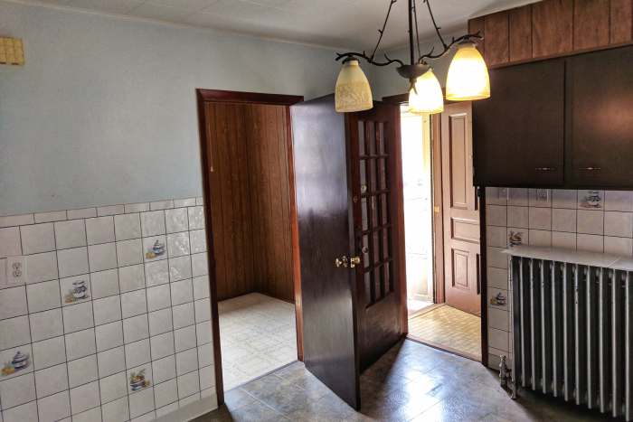
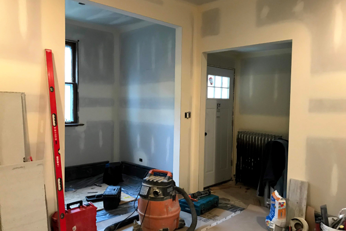
These “before” and “during” images show the impact of removing arguing doors and widening entryways. More natural light comes in from the breakfast room and the new back door windows.
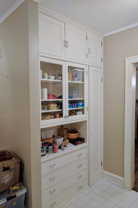
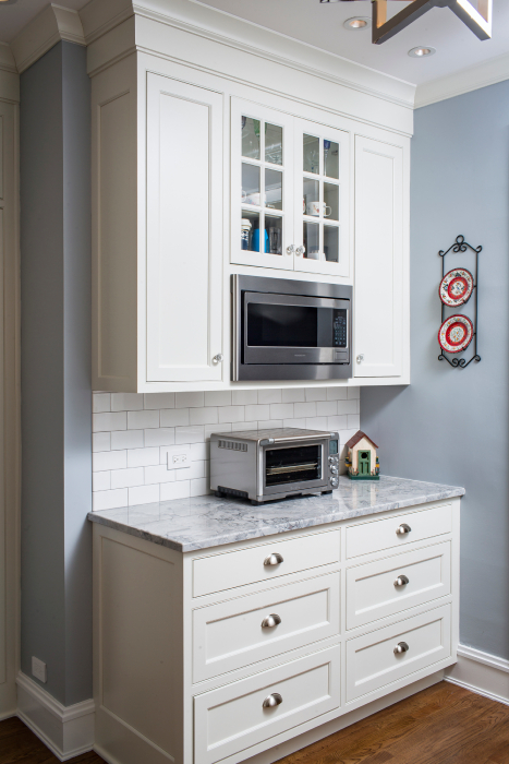
We replaced an original built-in with an update that maintains the home’s character and opens up the kitchen.
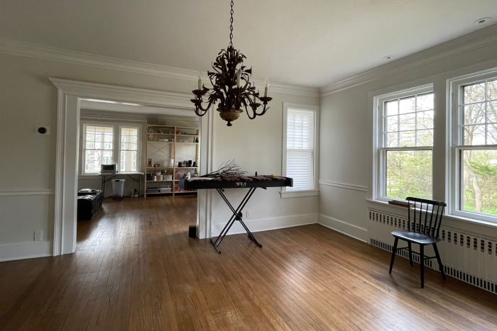
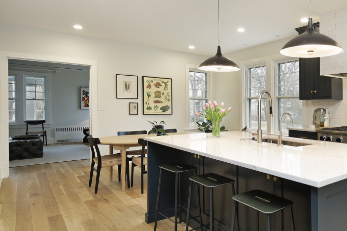
The entry to the living room was shifted to the left to make space for a dining area and improve traffic flow.
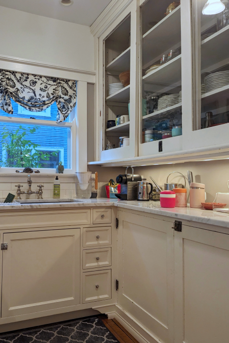
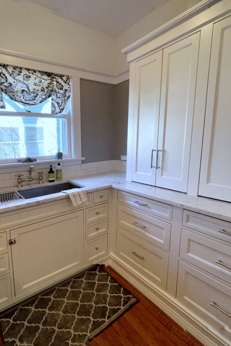
We added counter space to the left of the cabinet, dropped the built-in height to improve the proportion, and topped it with crown molding.
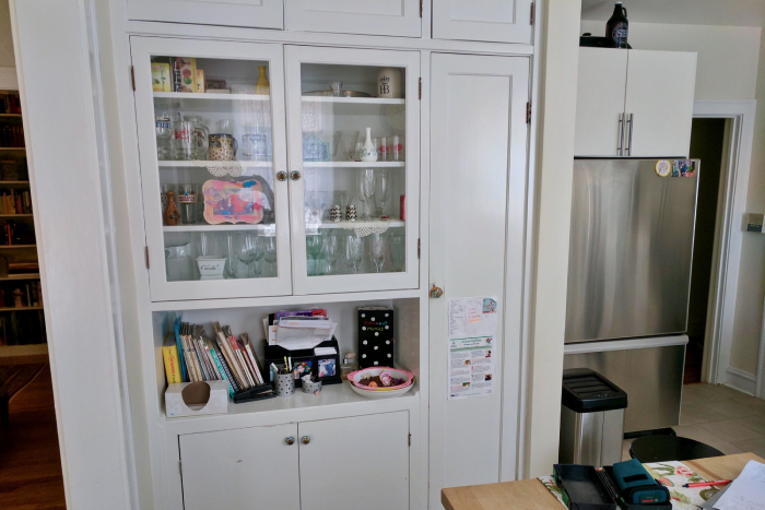
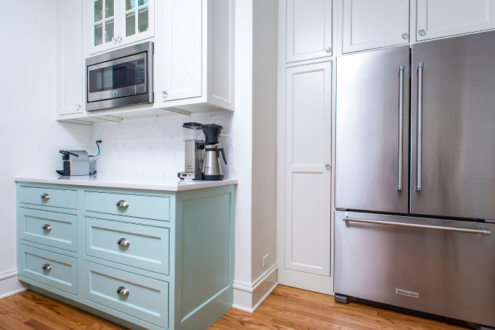
Pushing back the tall pantry cupboard flush with the fridge kept the front counter open-ended.
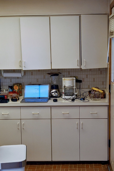
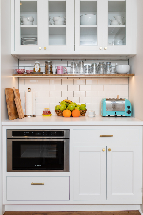
Removed the soffit, raised the cabinets, and added a floating shelf with recessed LED lighting to brighten and improve the space.

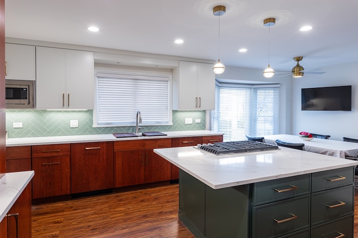
The larger island now has room for seating. A new flatscreen mounted on the wall frees up counter space, and a lighting plan with pendants and recessed lights better illuminates all work areas.
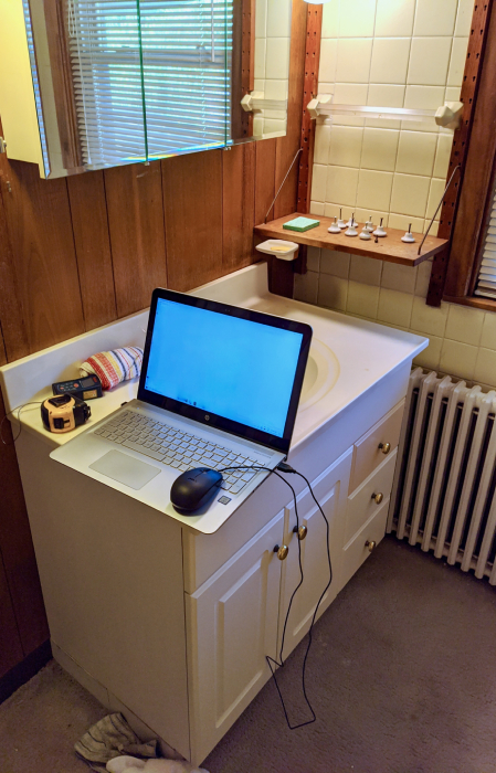
A cast iron baseboard unit replaced the radiator and the sink was moved to the opposite wall.
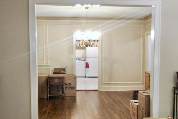
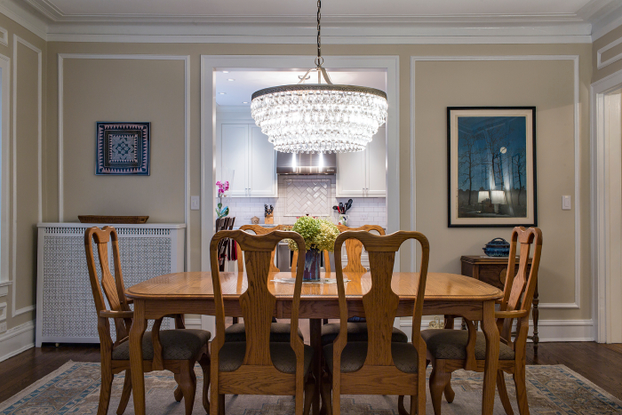
Enlarging the dining room entryway increased the sense of space from the living room to the kitchen.
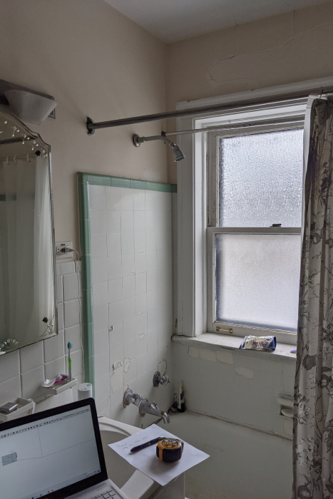
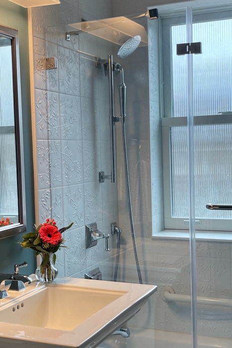
This bathroom, visible from the entryway of the home, needed to be visually appealing. Swapping the bulky vanity for a pedestal sink and adding modern updates, contrasting paint, tile, and fixture choices achieved the desired effect.
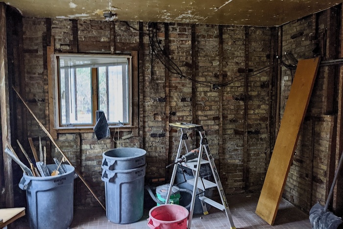
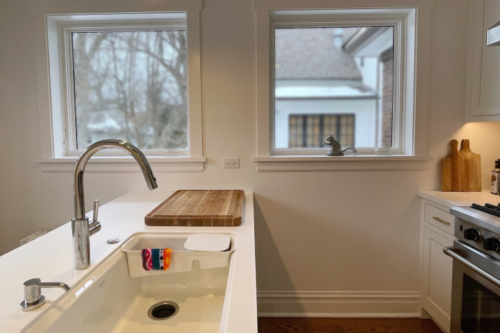
The window on the left had previously been replaced with an improper header.
We installed a steel lintel and added a twin window on the right.
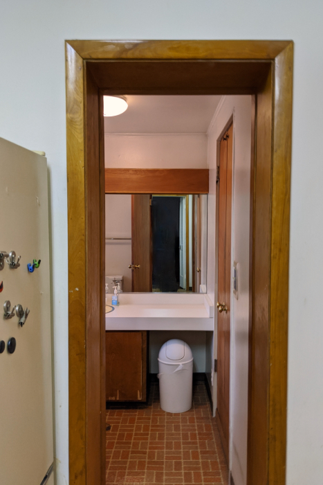
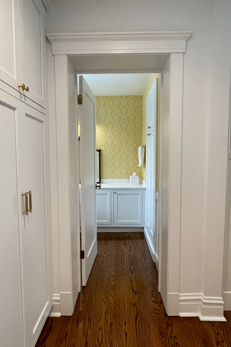
The refrigerator on the left in a butler’s pantry was replaced with pantry cabinets. Removing the wall mirror in favor of yellow wallpaper improved the view down the hallway.
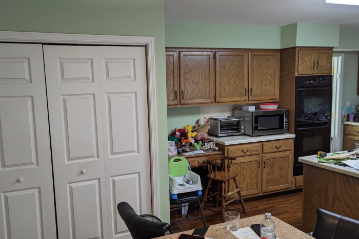

The pantry’s sleek new doors and gold hardware match the cabinet facing of the fridge in its new location.
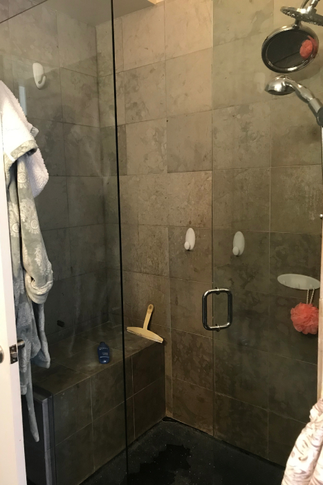
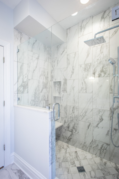
A half wall conceals the shower bench and white porcelain tile brightens the room.
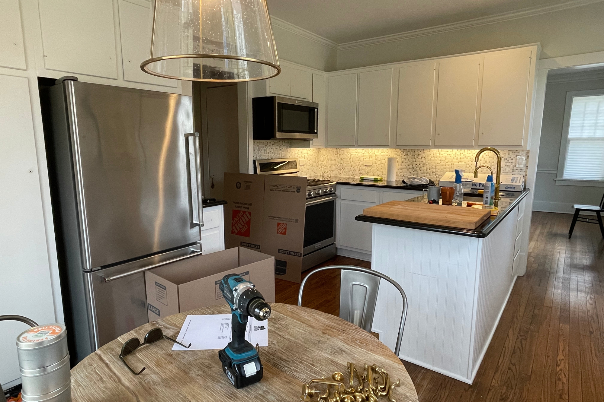
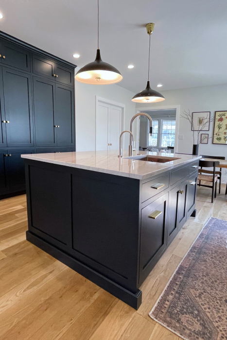
This view shows the dramatic difference after moving the refrigerator and opening the rear wall.
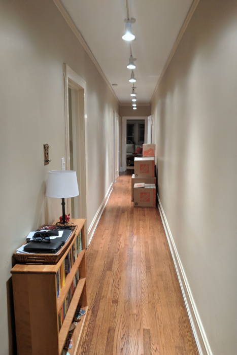
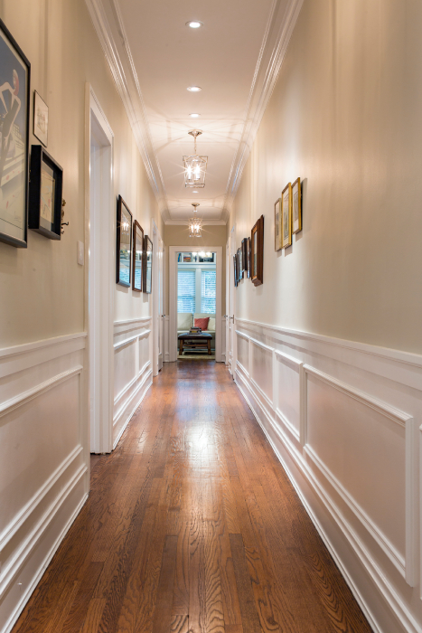
Walls of white wainscotting and contrasting color draw your eye down the hall and anchor framed artwork.
