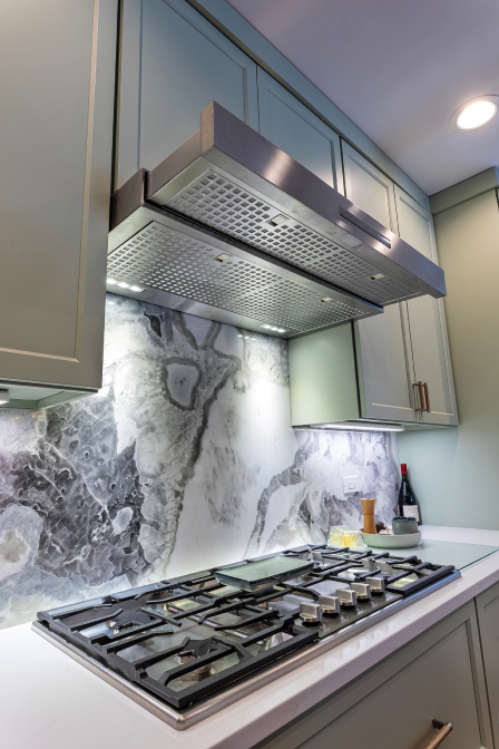
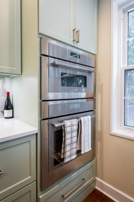
Similar Layouts · Different Styles · Colorful Upgrades
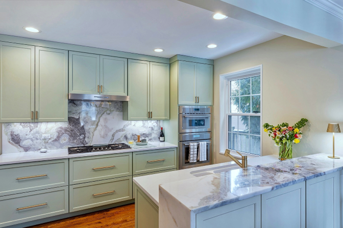
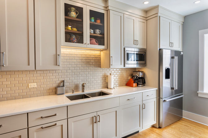
Two Takes on a Similar Kitchen Design
It’s fun to see how two completed kitchen projects with similar objectives and footprints reflect each homeowner’s singular style.
Shared Goals
-
- Improve flow and functionality
- Incorporate a brighter color palette
- Solutions for problem areas
- Improve the lighting plan
Shared Design Elements
Our designer’s professional culinary training and years of practical experience result in kitchens that are functional, efficient, and look terrific.
-
- We replaced unwanted features in each room with improved storage and expanded countertops.
- Reoriented task areas to create more efficient work triangles.
- Cabinetry in duo color schemes brings visual interest and a brighter, more modern aesthetic to each space.
Differing Kitchen Personalities
Take a look at the gallery below to see the results.
The Gallery
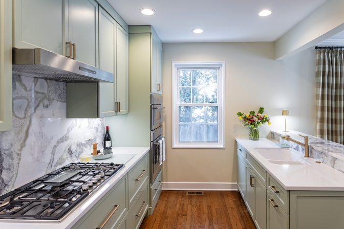
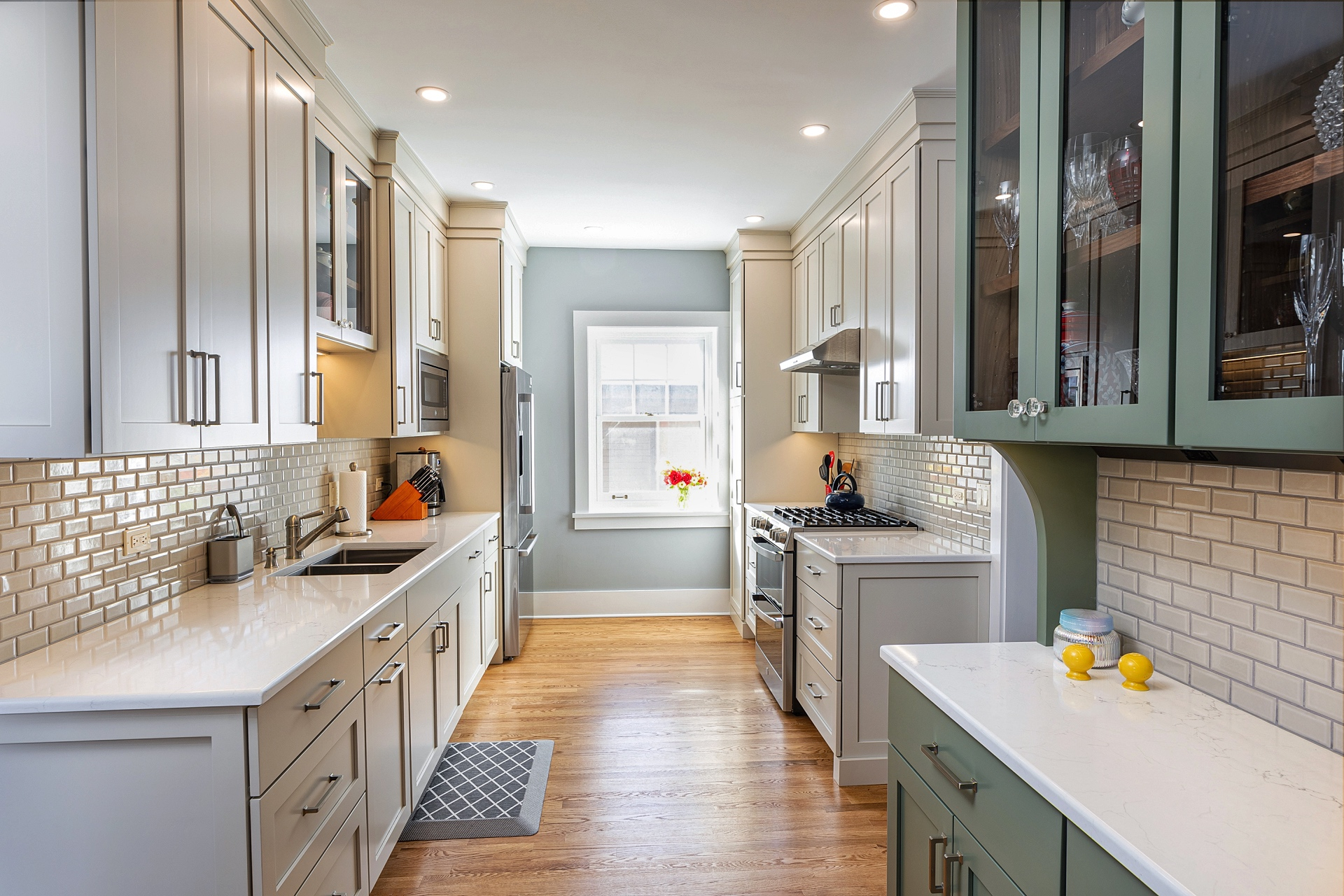
A redesigned lighting layout focuses illumination on the new workstations in each kitchen.
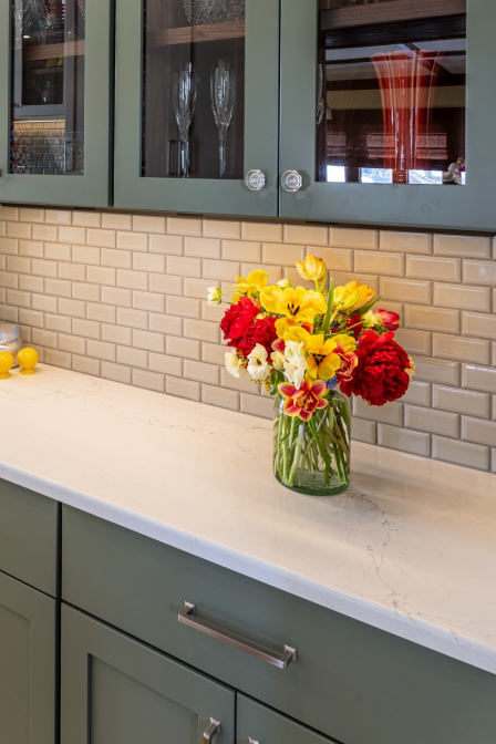
Colorful cabinets replace the dark oak cupboards.
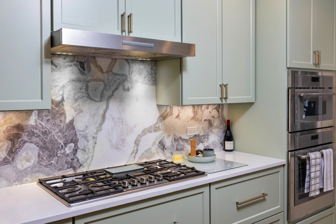
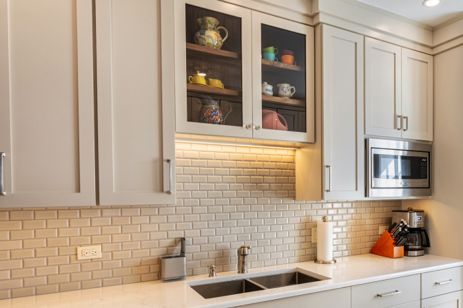
Removing unnecessary and unwanted wall openings for the win!
In the kitchen on the left, there was a blocked exterior window, and on the right, we removed a little-used interior pass-through. The results: added storage, more efficient workstations, and a show-stopping visual element in each kitchen.
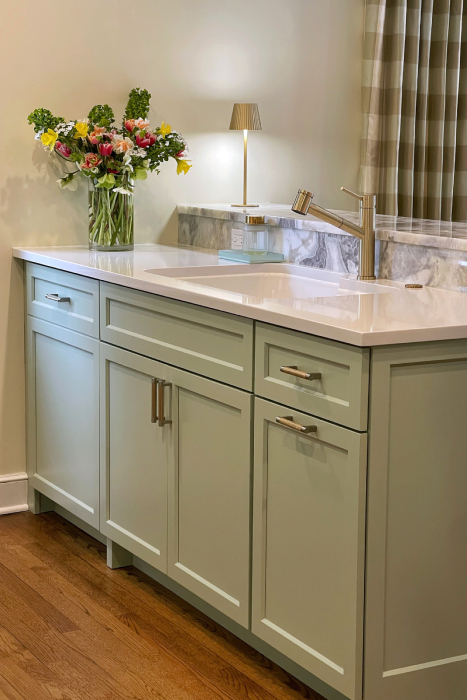
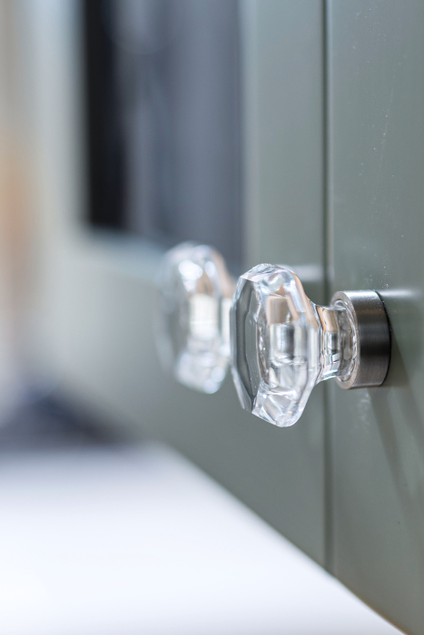
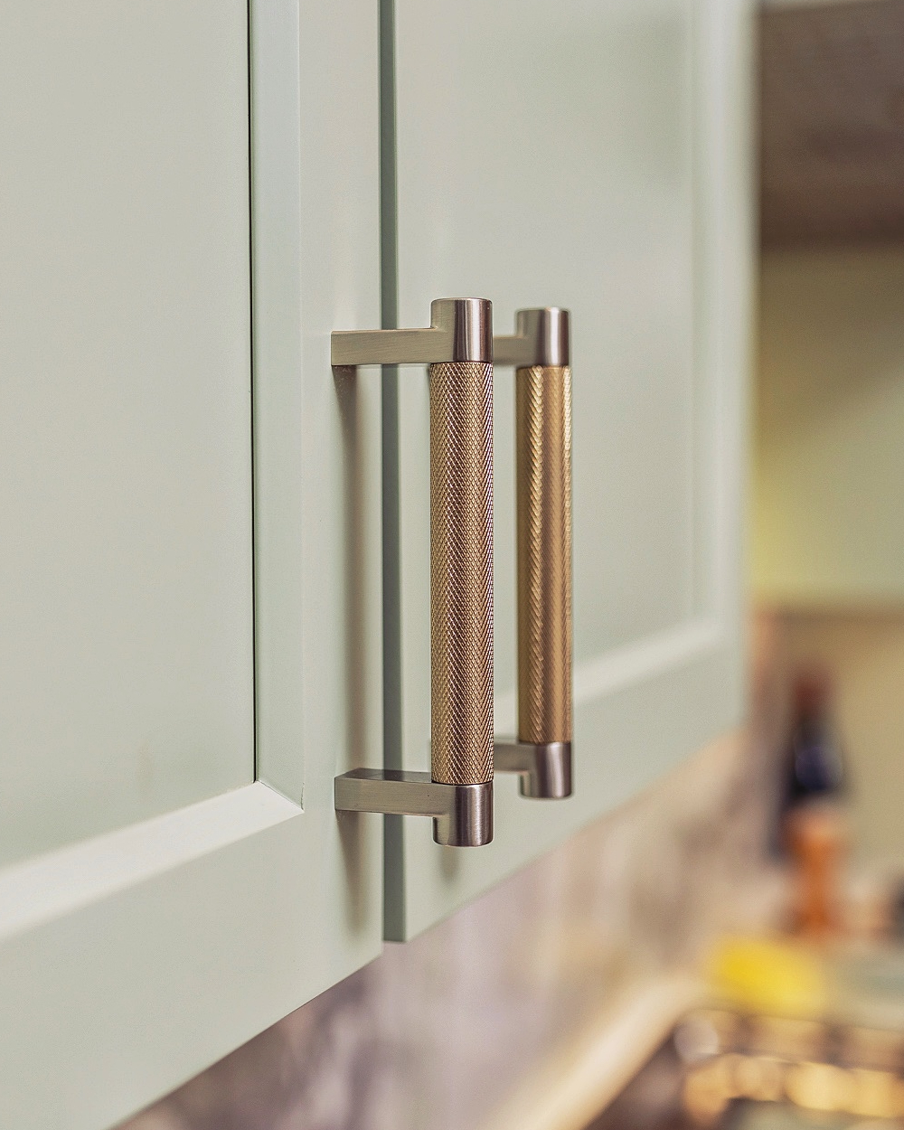
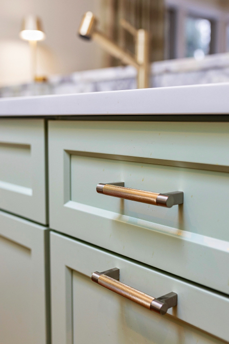
Gold fixtures, burnished cabinet hardware, and glass knobs add touches of brightness and personality.
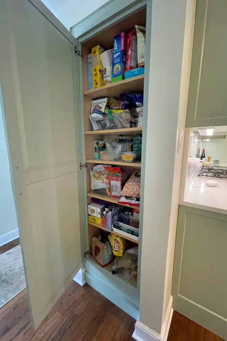
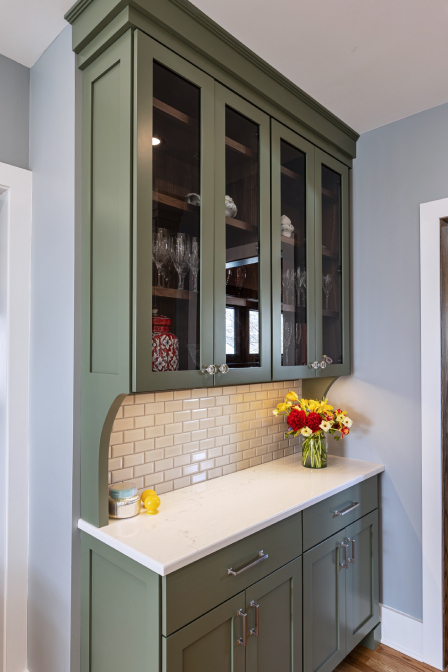
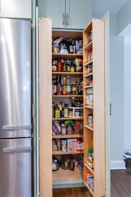
More storage: A shallow broom closet was expanded into a floor-to-ceiling pantry cabinet (right), and a built-in with counter workspace (left) replaced a narrow table/bulletin board combo.
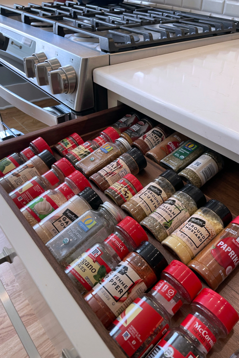
Spice storage: Cook’s preference — drawer vs. doors.